
Using the Intersink brand
Everything you need to show our logo and style correctly: files to download, the colours and type we use, and a few simple rules.
Logo

For headers, documents and press. Our first choice.
SVG
App icons, favicons and small spaces.
SVG
Print in a single colour, or on busy backgrounds.
SVG
For dark or brand-coloured backgrounds.
SVGGive it room
Keep clear space around the logo at least as wide as the sun in the mark. Don't show the mark smaller than 16 px on screen or 6 mm in print.
Keep it as it is
Don't stretch, rotate, recolour, outline or add effects to the logo, and don't rebuild the name in another typeface.
Write it in lowercase
The name is always Intersink, one word, lowercase, even at the start of a sentence.
Calm neutrals, one blue accent
Most of the product is neutral white and grey. Blue marks what you can act on, so when it appears it means something.
#1F56D6Our accent: links, the mark and the one button that matters.
#0B1736The suite bar and dark surfaces.
#101828Text.
#475467Secondary text.
#EBEEF4Page background.
#FFFFFFCards and surfaces.
Illustration pastels
#FFE4CC#E9E4FB#DCEFE6#E1ECF9#FBE1E6#FDF1C7#E4EFD9Inter, everywhere
We use Inter for headings and text, from the app to this website. Headings are bold with tight spacing; body text is regular and roomy.
Every business you run, in one calm workspace.
Body text is set at 15 to 17 px with generous line spacing, in ink on mist or paper.
Ink on pastel, drawn by hand
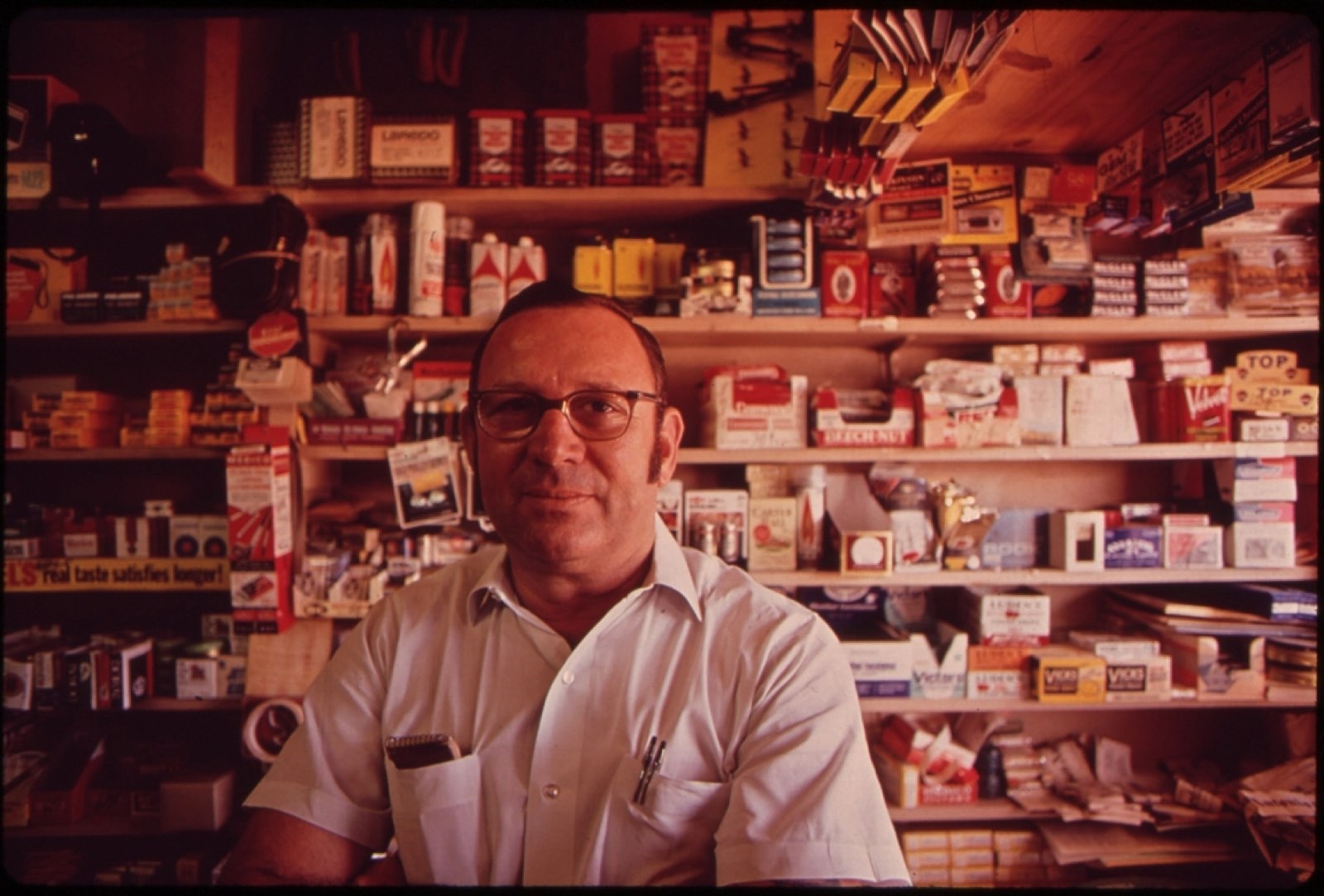
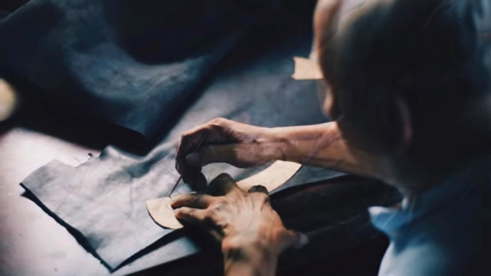
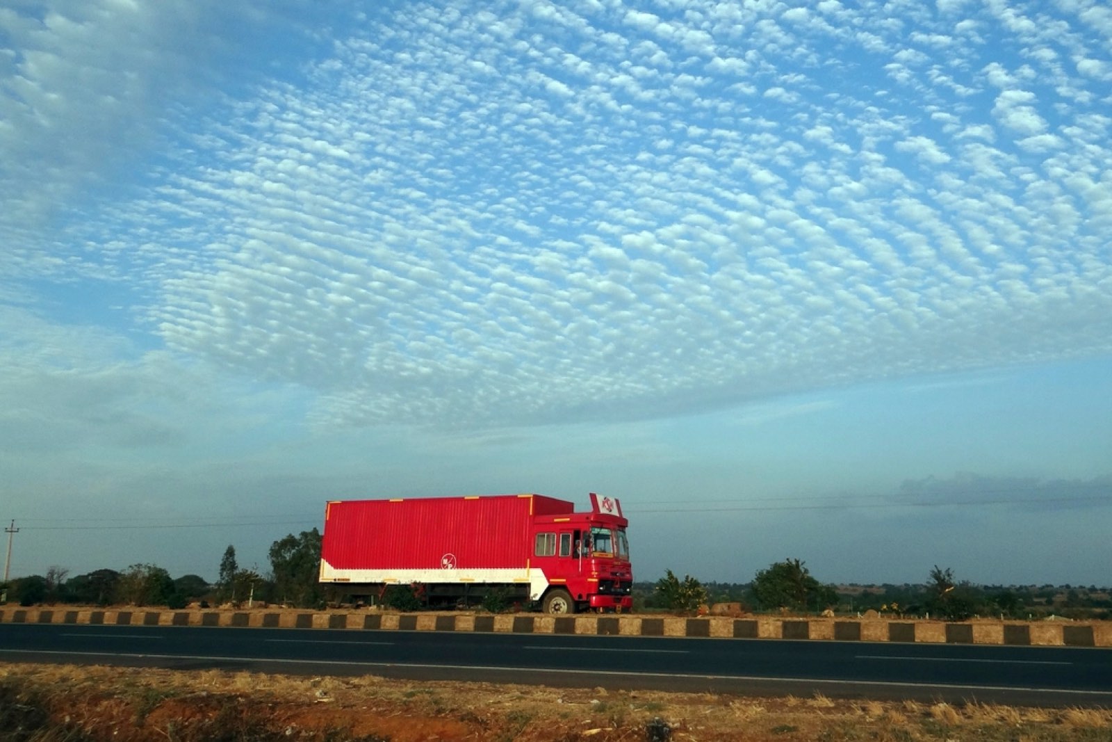
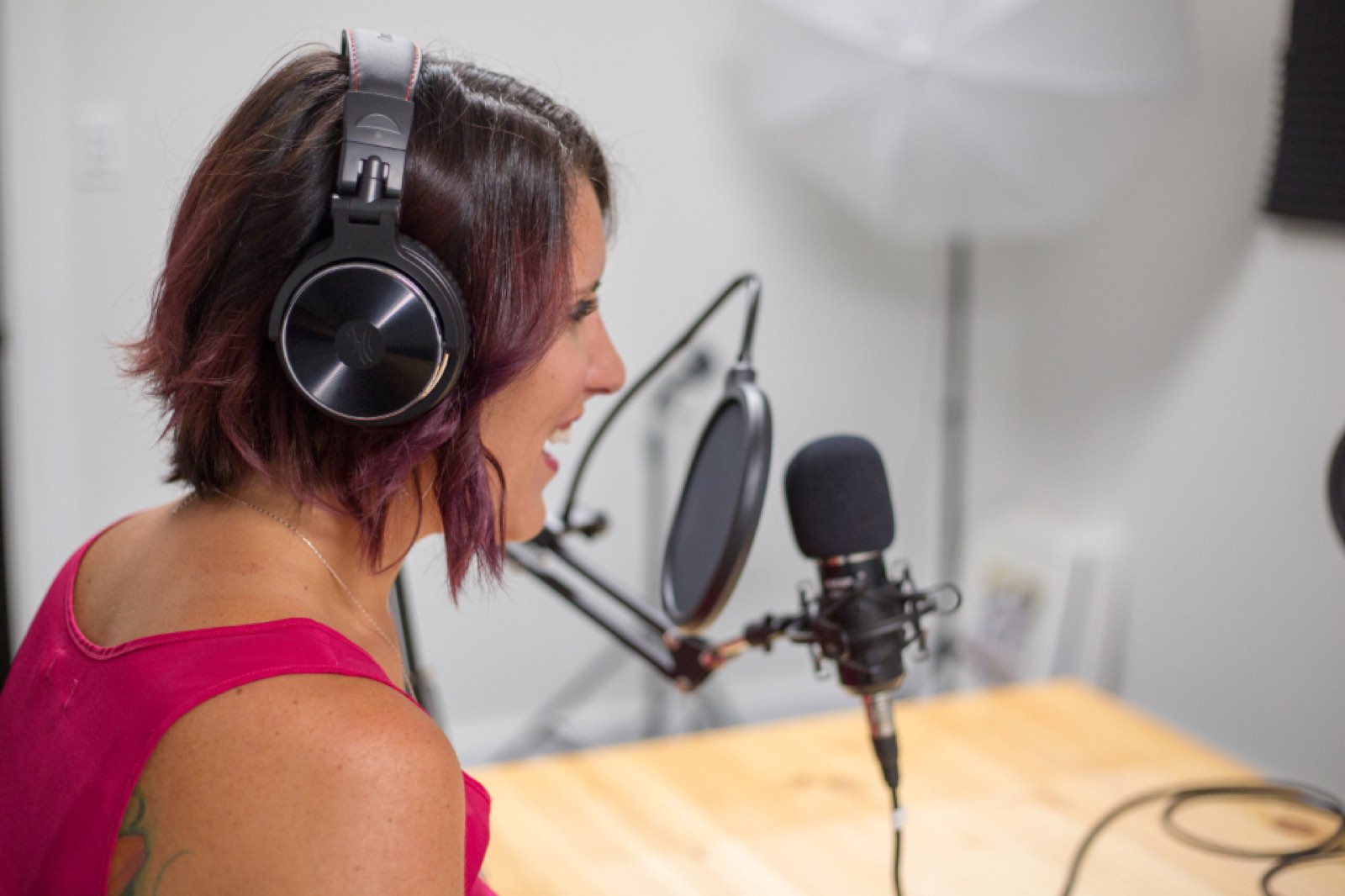
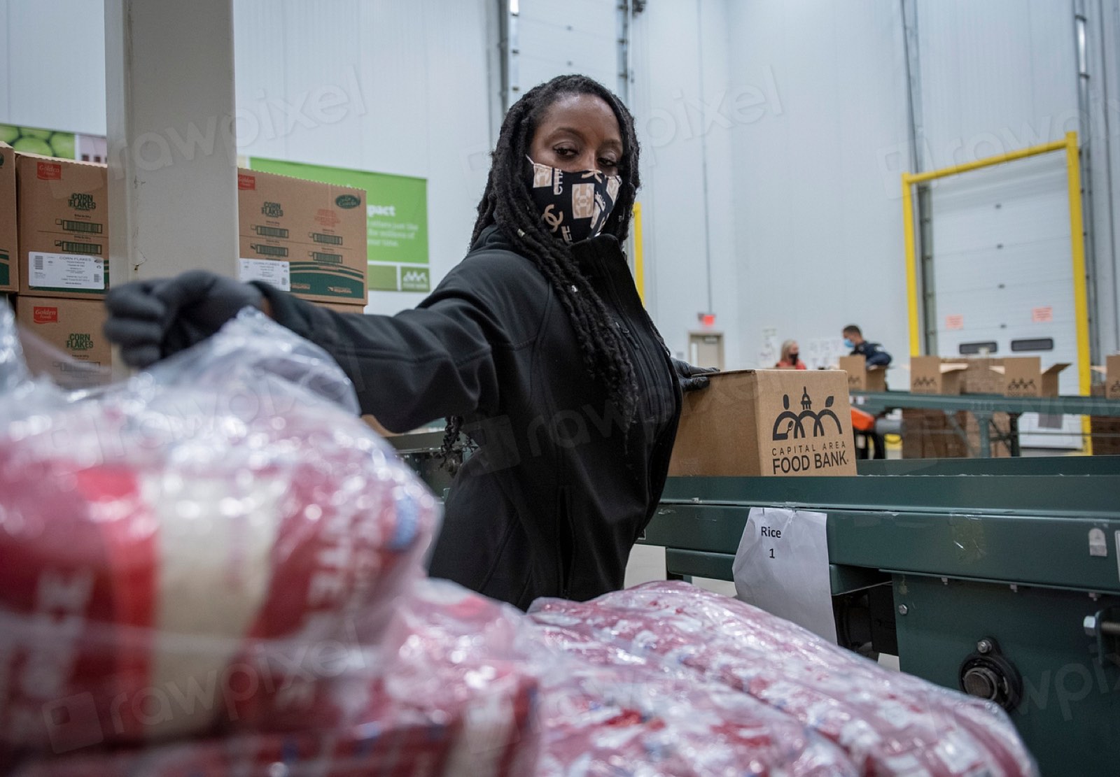
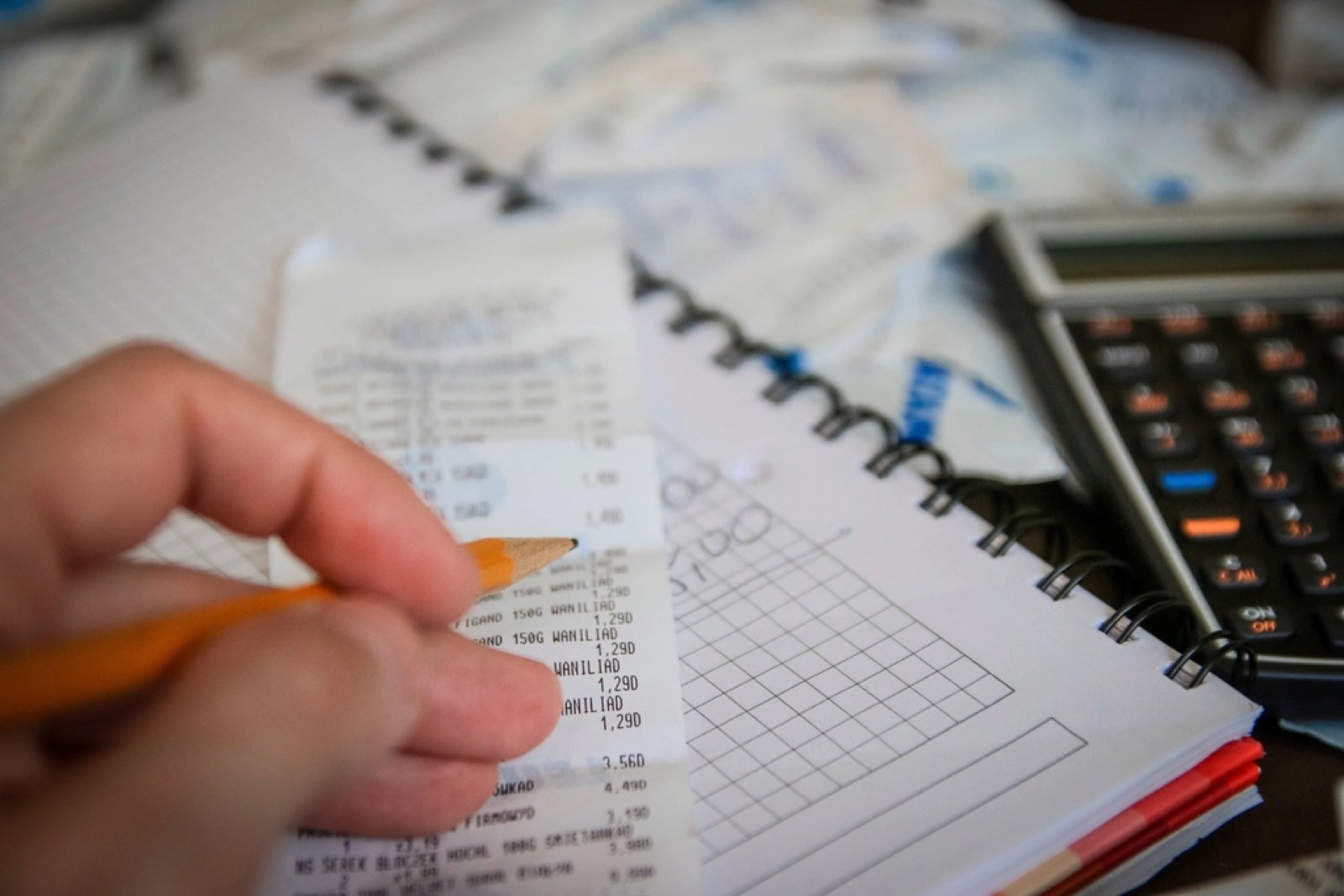
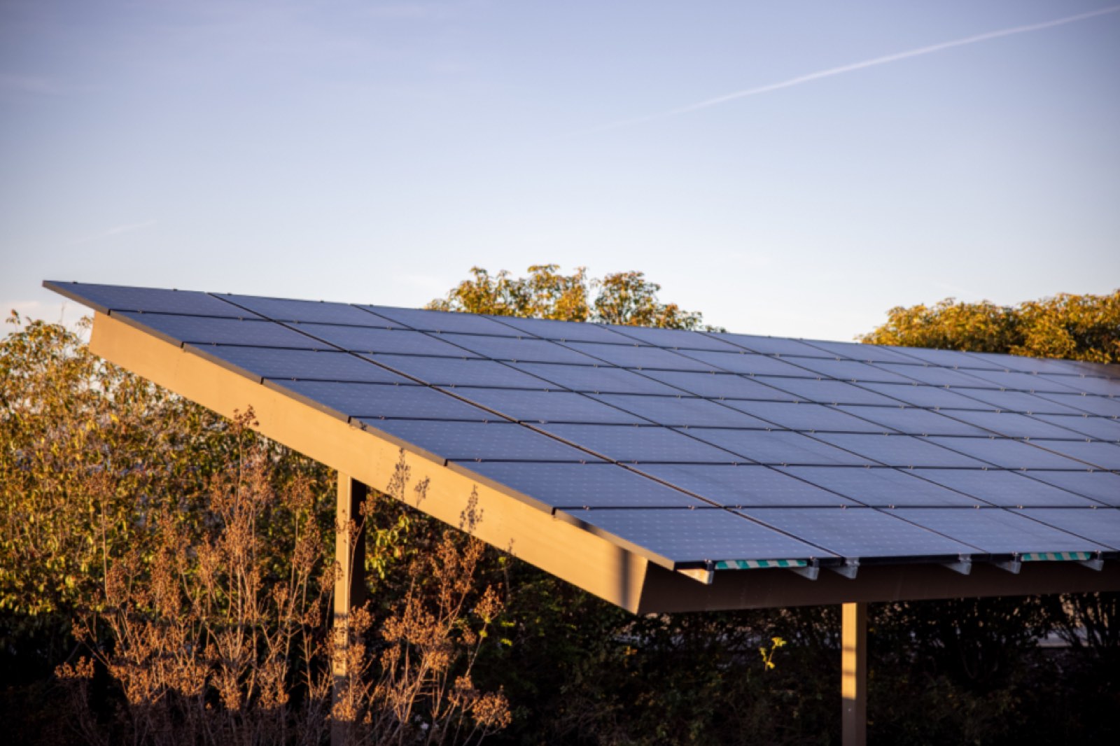
Businesses and channels are shown as small cartoons of what they do: dark ink lines and soft fills on a pastel tile. No gradients or glows. Photography is used separately, and only public-domain photos of real people at work.




Plain, warm and brief
We write the way a helpful colleague talks: short sentences, everyday words, no jargon and no hype.
“Your invoice is ready. It covers September.”
“We couldn't save that. Check your connection and try again.”
“Leverage our best-in-class synergy platform!”
“Error 0x80042: operation failed.”
Intersink and the sunrise mark are trademarks of Svayam Incarnation Limited. Using them doesn't mean we endorse you or your product. For anything not covered here, ask us.